
Short of a major lottery win (for which playing would be a good start), there’s zero way that we have the budget to purchase wallpaper from the deities over at Bradbury and Bradbury (for the record, my favourites, and the ones which I think would be best suited to the hallway would be their Jeffrey, B. J. Talbert, or Herter Brothers sets).
So I’m planning on designing and creating something of my own.
The post in which I linked a video by Bradbury and Bradbury showed them screen-printing a 17-color design. Yeah. 17 passes. Multiplied by however-many feet up and across. That’s a lot.
So I’m going to try to keep the palette to a minimum. Minimum palette = minimum passes.
Where do we start?
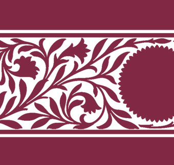
Let’s examine the Metford Frieze.

This is screen printed in layers of single colours, so let’s isolate the colours at their most basic.
- There is a solid mossy green background in the center
- There are bars of a browner green along the borders
- There are blueish bars along the border
- There are gold leaves, petals, patterns, and bars
- Just about everything is outlined with a maroonish-red.
Most of this is can be simplified to solid shapes except for the details and outlining.
To my knowledge, the only way you can get such fine outlines is either by hand-painting, screen-printing, or block printing.
If you’ve had any experience stencilling, you’ll know that the moment an outline makes a full return to its starting point, the entire shape falls out, and you’re left with a solid shape instead of an outline. This is why outlines in stencils usually have breaks/bridges – so that that it remains an outline (albeit a broken one… you have hand-fill the breaks if you want a solid outline).
Screens printing isn’t something with which I have any experience. And creating screens can be on the expensive and time-consuming side (not to mention completely wasted if you make a mistake when making them).
Block printing (either as a solid flat piece or as a roller) is possible, and it crossed my mind that 3D printing might be a solution here… but the results I’ve seen from block printing tend to be a bit inconsistent, and I don’t have a 3D printer.
So what can be done?
I think that the most straightforward solution would be to stencil the outlines as solid shapes – slightly larger than the feature shape – and then over-stencil with the feature colour/size.


In this example, you can see that as long as the overlay is slightly smaller than the solid background, the background transforms into an outline!
When you’ve assembled all of the elements, in what order would you paint them?
Using the Medford frieze as an example again, this is the order that I would try:
- Paint a strip of the green center fill
- Paint the solid maroon outline solids
- Paint the brown strips along the edges
- Paint the bluish accents
- Paint the gold features
So that’s five passes with five colours. The stripes/fills could be done with tape, so no stencil needed.
You’d have one stencil for the outlines, one for the bluish accents, and one for the gold features.
Of course, not every design has an outline – it’s not a requirement. So eliminating that detail would eliminate one step.
Sounds simple in theory.
We’ll have to see how it works out in reality.